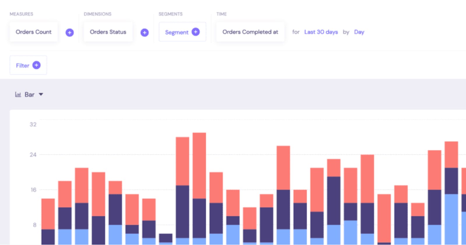
This is the last part from a guide on building dynamic analytics dashboards and applications with React, GraphQL, and Cube.js. It covers an introduction to the customization of the UI. At the end of the blog post I'll add links on customization of individual components of the dashboard, such as query builder and charts itself.
Also, below you can see the demo of the final application. Online demo is available here.
The dashboard template we generated is using Ant Design UI React library for all the UI components. It is one of the most popular React UI kits alongside Material UI. It uses Less as a stylesheet language and allows us to customize the design by overriding default Less variables.
As I mentioned in the first chapter, our Dashboard App is based on Create React App (CRA). Currently, it doesn't support Less out of the box, and to make it work, we need to use an eject command.
Create React App provides a fully configured environment and a default configuration. And all this configuration is hidden from you. But when you eject, all that configuration will be exposed to you. It means that you will get full control and will be able to add things like Less support. But at the same time, you will be responsible for maintaining all of that configuration.
eject is irreversible. You need to commit your changes before and then run eject in the dashboard-app folder.
$ git commit -a
$ yarn eject
Once you've run it, you can find a new folder called config. Inside the config folder, you can find all the project configuration files, but today we only need the webpack.config.js file.
Now let's install Less.
$ yarn add less less-loader
Next, we need to modify the webpack configuration file. Open config/webpack.config.js and Find the cssRegex constant and change it:
-const cssRegex = /\.css$/;
+const cssRegex = /\.(?:le|c)ss$/;
Then, find the getStyleLoaders function. On the use array, after the css-loader object, add:
{
  loader: require.resolve('less-loader'),
  options: {
    importLoaders: 1,
    javascriptEnabled: true,
  }
}
That's it! With this in place, we are ready to override some of the antd's default variables and styles. We are going to customize some variables according to the antd's Customize Theme guide.
Create a dashboard-app/src/variables.less file with the following content.
// Colors
@dark-blue: #43436B;
@primary-color: @blue-6;

// Base Scaffolding Variables
@font-family: 'DM Sans', sans-serif;
@font-size-base: 16px;
@body-background: #EEEEF5;
@heading-color: @dark-blue;
@text-color: #878F9F;

// Layout
@layout-header-background: @dark-blue;
@layout-body-background: #EEEEF5;
@layout-header-height: 48px;

// Buttons
@btn-primary-bg: #FF6492;
@btn-height-base: 40px;

@btn-disable-color: white;
@btn-disable-bg: #FF6492;
@btn-disable-border: #FF6492;

@btn-default-color: @dark-blue;
@btn-default-border: #D0D0DA;

// Input
@input-color: @dark-blue;
@input-height-base: 40px;

// Select
@select-border-color: #ECECF0;

// Modal
@modal-body-padding: 32px;

// Typography
@typography-title-font-weight: bold;
Next, let's create a index.less file, which will be imported in index.js. Here, we do several things: import antd styles, import the Dm Sans font from Google Fonts, import the just-created file with modified variables, and finally, add some minor customization.
@import '~antd/dist/antd.less';
@import url('https://fonts.googleapis.com/css?family=DM+Sans&display=swap&css');
@import 'variables.less';

.ant-btn-primary[disabled] {
  opacity: 0.4;
}

.ant-modal-header {
  border-bottom: none;
  padding: 40px 32px 0 32px;
}

.ant-modal-footer {
  border-top: none;
  padding: 0 32px 40px 32px;
  text-align: left;
}

.ant-select {
  color: @dark-blue;
}

.ant-select-dropdown-menu-item {
  color: @dark-blue;
}
The last thing is to import index.less in our index.js. Replace the old import of index.css and feel free to delete this old file as well.
-import "./index.css";
+import "./index.less";
The styles above customize our design globally, changing the look of some components. But to customize some specific components, like the top menu, we are going to use Styled Components.
Styled Components allows you to write CSS right inside your components. It is a variant of "CSS-in-JS"—which solves many of the problems with traditional CSS like selector name collisions.
Let's first add styled-components to our project.
$ yarn add styled-components
The first component to style with Styled Components is going to be the <Header />. Let's first download a logo in SVG. We are using the Cube.js logo here as an example, but you can place your product's logo the same way.
$ cd dashboard-app/src/components && curl http://cube.dev/downloads/logo.svg > logo.svg
Next, replace the content of the src/components/Header.js with the following.
import React from "react";
import { SignOut } from "aws-amplify-react";
import { Layout, Menu } from "antd";
import { Link } from "react-router-dom";
import styled from 'styled-components';
import logo from './logo.svg';

const StyledHeader = styled(Layout.Header)`
  padding: 0 28px
`

const StyledMenu = styled(Menu)`
  background: transparent;
  line-height: 41px;
`

const MenuItemStyled = styled(Menu.Item)`
  && {
    top: 4px;
    border-bottom: 4px solid transparent;

    &:hover {
      border-bottom: 4px solid transparent;
      & > a {
        color: #ffffff;
        opacity: 1;
      }
    }
  }
  &&.ant-menu-item-selected
  {
    color: white;
    border-bottom: 4px solid white;

    & > a {
      opacity: 1;
    }
  }
  && > a {
    color: #ffffff;
    opacity: 0.60;
    font-weight: bold;
    letter-spacing: 0.01em;
  }
`

const Logo = styled.div`
  float: left;
  margin-right 40px;
`

const signOutStyles = {
  navButton: {
    color: "white",
    background: "none",
    textTransform: "none",
    fontSize: "13px",
    fontWeight: "bold",
    minWidth: 0
  }
}

const Header = ({ location }) => (
  <StyledHeader >
    <Logo>
      <img src={logo} />
    </Logo>
    <StyledMenu
      mode="horizontal"
      selectedKeys={[location.pathname]}
    >
      <MenuItemStyled key="/explore">
        <Link to="/explore">Explore</Link>
      </MenuItemStyled>
      <MenuItemStyled key="/">
        <Link to="/">Dashboard</Link>
      </MenuItemStyled>
      <MenuItemStyled style={{ float: "right", paddingRight: 0 }} key="sign-out">
        <SignOut theme={signOutStyles} />
      </MenuItemStyled>
    </StyledMenu>
  </StyledHeader>
);

export default Header;
Yay! We've finished another chapter. We have customized global antd variables and updated the design of our navigation bar. Restart the Dashboard App server and test the changes at http://localhost:3000.
I hope it gives you a general idea of how to customize your dashboard. Below you can find links to customization guides of the specific components of the dashboard:
Please let me if you have any questions or feedback about this guide - I'd love to hear from you, thank you!
